If you want to see the top Facebook ads in one place, you’ll love this list. It features all of our top picks for 2024 from statics to UGC and even themed ads, along with brief notes on why these ads work.
We hope this distillation of our 1000s-ads-long swipe file helps to inspire your winning Facebook ads!
Quick navigation:
- Top static ads
- Top video ads
- Top UGC ads
- Top carousel ads
- From this to this ads
- General showcase ads
- How it works ads
- Steps ads
- Ingredients/Features ads
- Paced to music ads
- Quick cuts ads
*when using the quick navigation, please allow for lazy loading to catch up – give it a few seconds :)
Achieve better ROI from your ads
Serious about growth? Let’s talk about getting better leads and higher ROI.
SCHEDULE A CALL
Watch Art explain the five elements that can make your Facebook ad creatives more effective.
Top Static Ads
1. Portland Leather
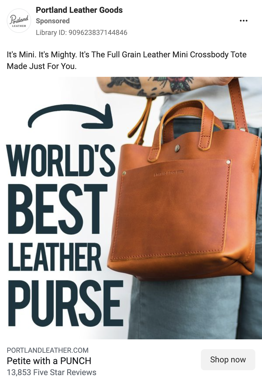
How do you convey that your product is small, yet powerful? Here’s an idea from Portland Leather: the whole concept behind this ad is based on this notion, and the image does a great job of illustrating it. A simple model shot focusing on the purse is accompanied by a big, bold headline, with an arrow pointing toward the product. The boldness of the lettering matches the focus on the bag – it commands attention, but the model adds scale to it, making sure that the approach won’t make it look like it’s too large for you to carry around. Small choices coming together in a complete, well-organized message.
2. Glossier
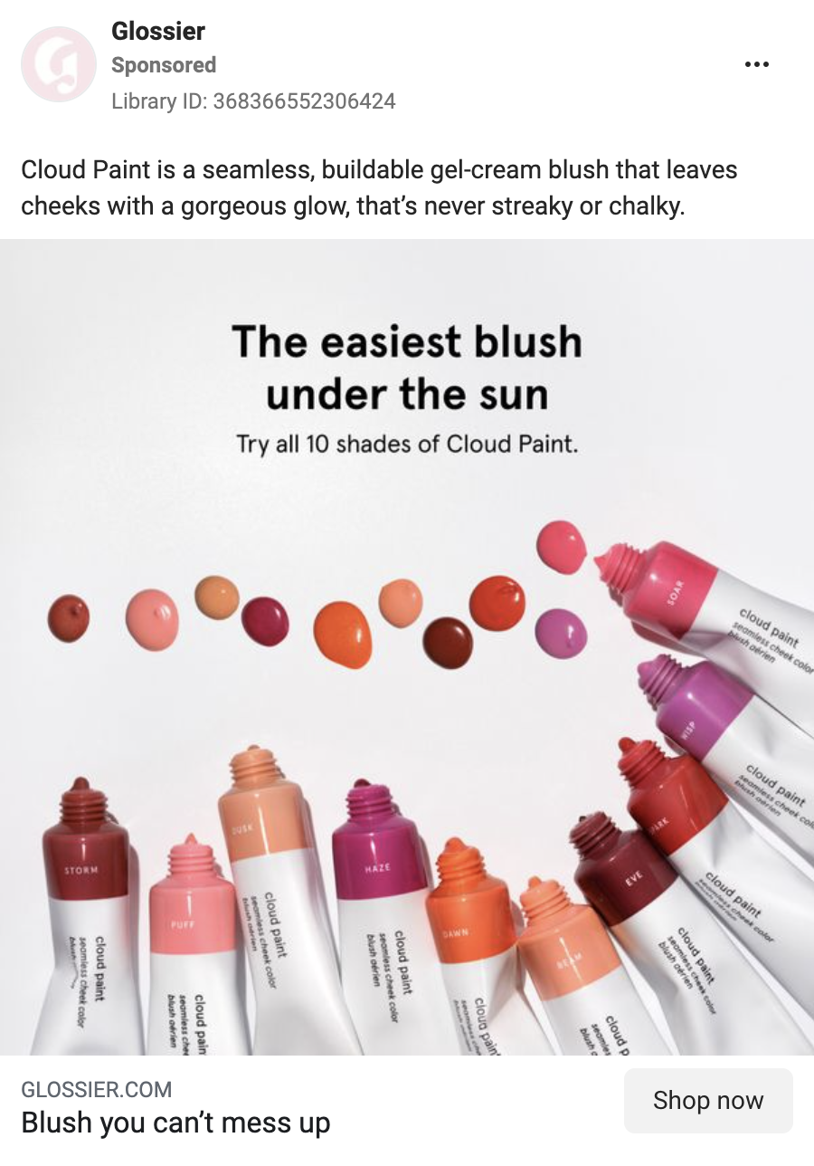
In this ad, Glossier shows its product like it is – not only are all 10 shades of blush represented as product tubs, but also as drops of the actual color aligned in a palette. Combined with the overall message stressing the ease of use – between the on-image claim and the text headline – such simplicity makes for an enticing offer that promises high quality, yet undemanding product.
3. Magic Spoon
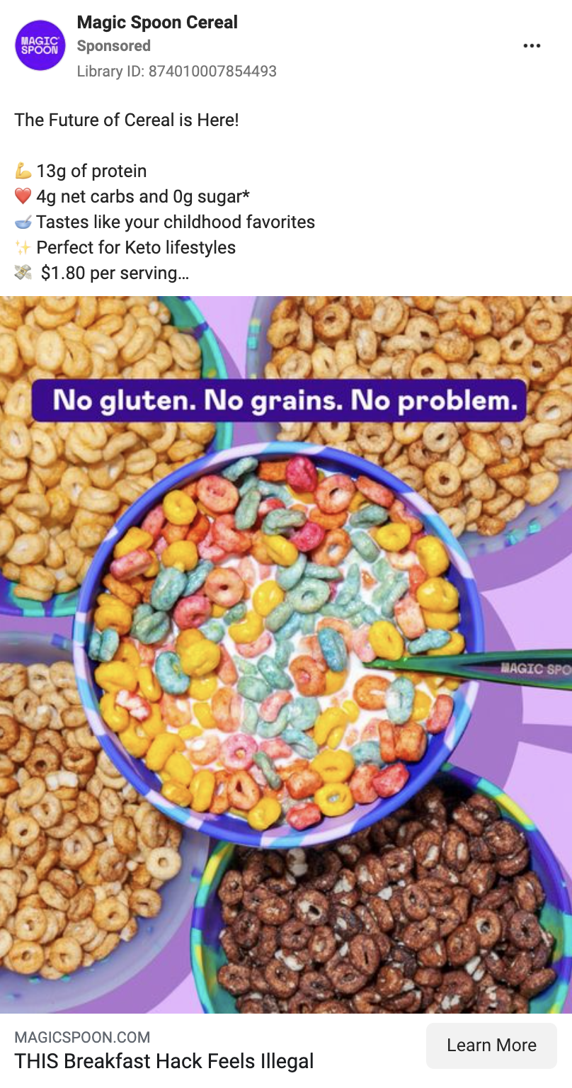
Three simple slogan lines on top of a really colorful, well-saturated photo makes for an incredibly eye-catching creative that’s bound to make you stop scrolling. This is what a winning ad looks like – clean, to the point, and leaving a definite impression.
4. Allplants
Convincing your audience using proof from a reputable source can go a long way. Here, allplants frames its special offer around a layout with a BBC-branded logo in the header, formulated like an article from their website. It’s built so the brand is seen as the talk of the town – and now you, the audience, can take them up on that, at a discount.

5. ARX Fit
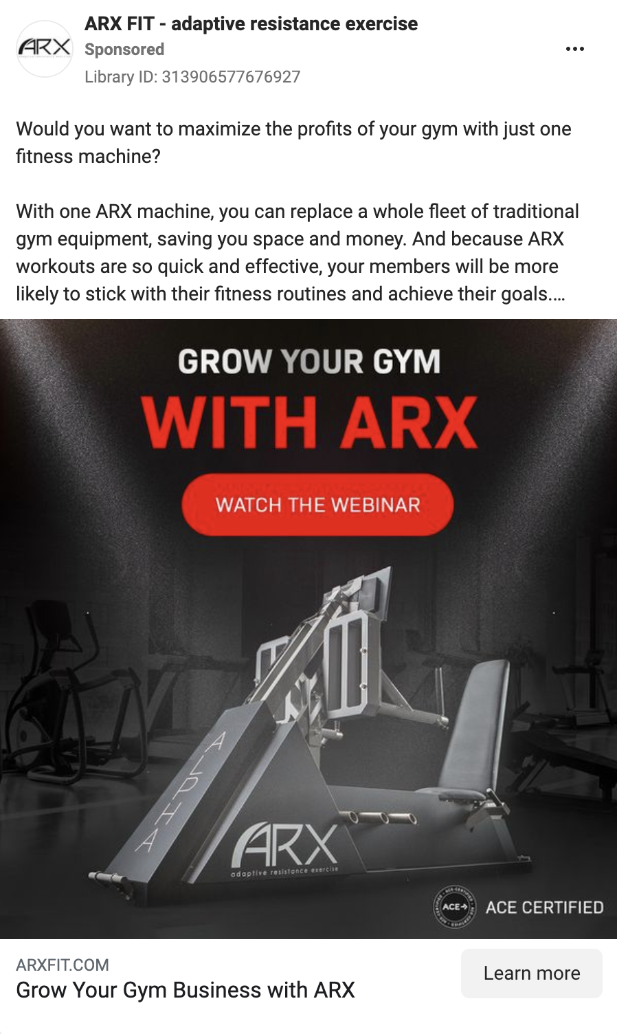
Now, full disclosure: this is an ad we designed ourselves but, at the risk of sounding conceited, we still think that it’s at the level of all the other ads on this list. ARX is an innovator in the field of high-tech exercise machines, and that’s what we wanted to convey here – a dull and conventional gym shot in the background that pales in comparison to a spotlight-lit, state-of-the-art ARX machine. A big and bold headline gets the point across, addressing the ad to its audience – people interested in improvement of their gym businesses – and the button directs them to ARX’s webinar. Additionally, we included the seal of ACE certification, to contribute additional proof to the proposition.
6. Conzuri
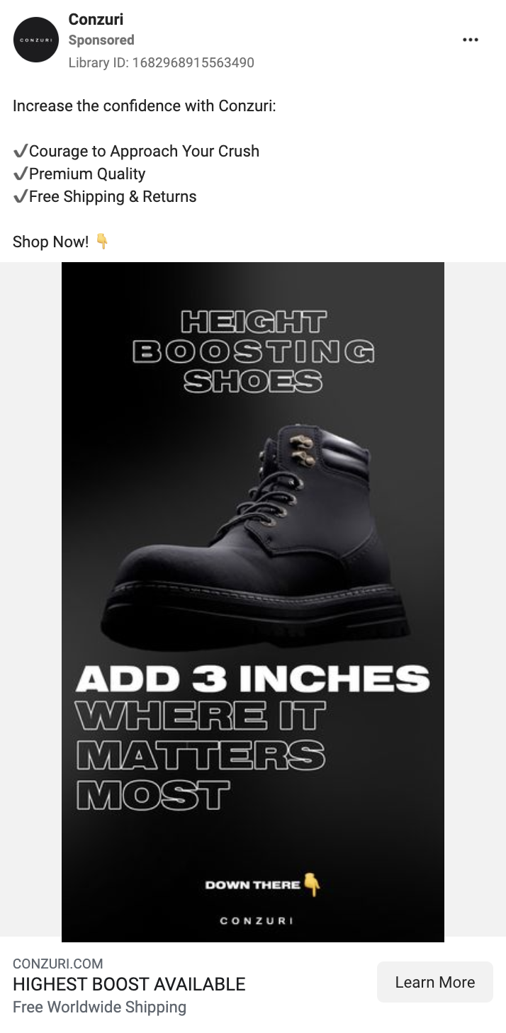
Who said a good ad can’t get a bit cheeky? While Conzuri’s ad operates on the big and bold standards that many ads on this list also do, matching a heavy boot with a heavy font, the message of the ad – both in the image and in the text copy – hinges on innuendos and implications related to the confidence-boosting nature of the product’s benefits. Another interesting aspect is the directional CTA – “Down there” sticks out thanks to the pointing down emoji, which contrasts well with the dark tones of the rest of the ad.
7. Adobe
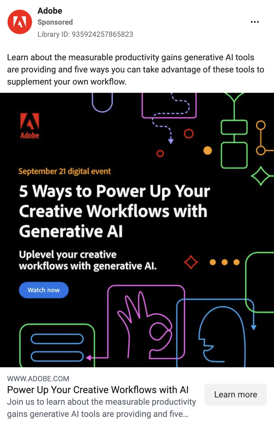
There isn’t one good way to show creativity, but Adobe is here with a take on it that’s worth attention. The headline is clearly the focus here – it’s about watching the event, after all – but the background can’t be left plain. So Adobe employs various shapes gesturing at the subject: connected boxes and meandering arrows meant to suggest workflows and nicely frame the ad. The talking head stresses communication, and the “ok” hand sign can be read both as a marker of quality, as well as overall understanding.
8. Canva
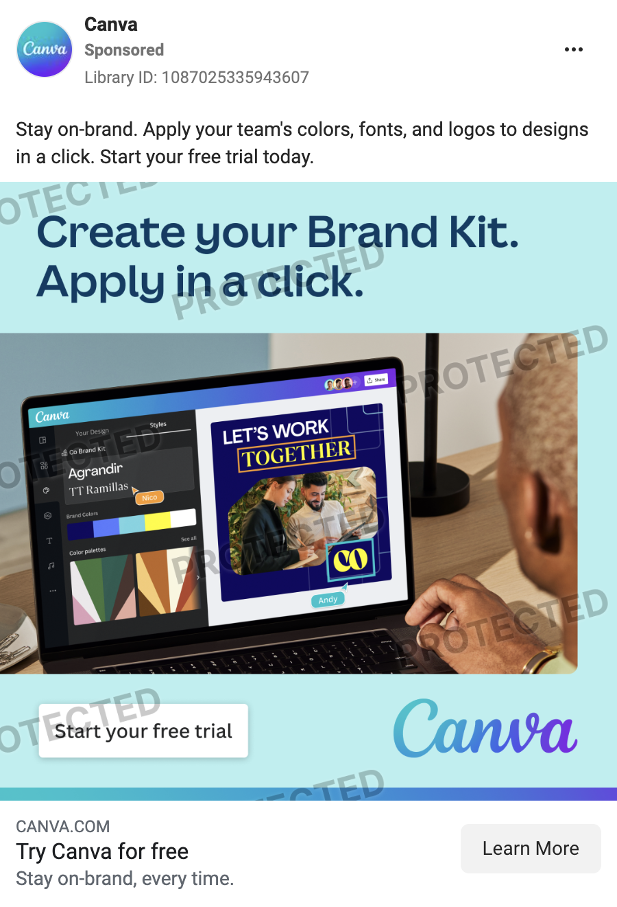
Canva’s service is all about design, so it’s expected that they will want to show it off in their ads. This one stresses transparency – a simple background, with a small gradient line up top to align with the gradient of the logo; a short, double-simple-sentence slogan to keep it to the point; a contrasting CTA button; and, to cap it off, an illustration of the platform in action. All the components are here and working in concert to present Canva’s proposition.
9. GoPro
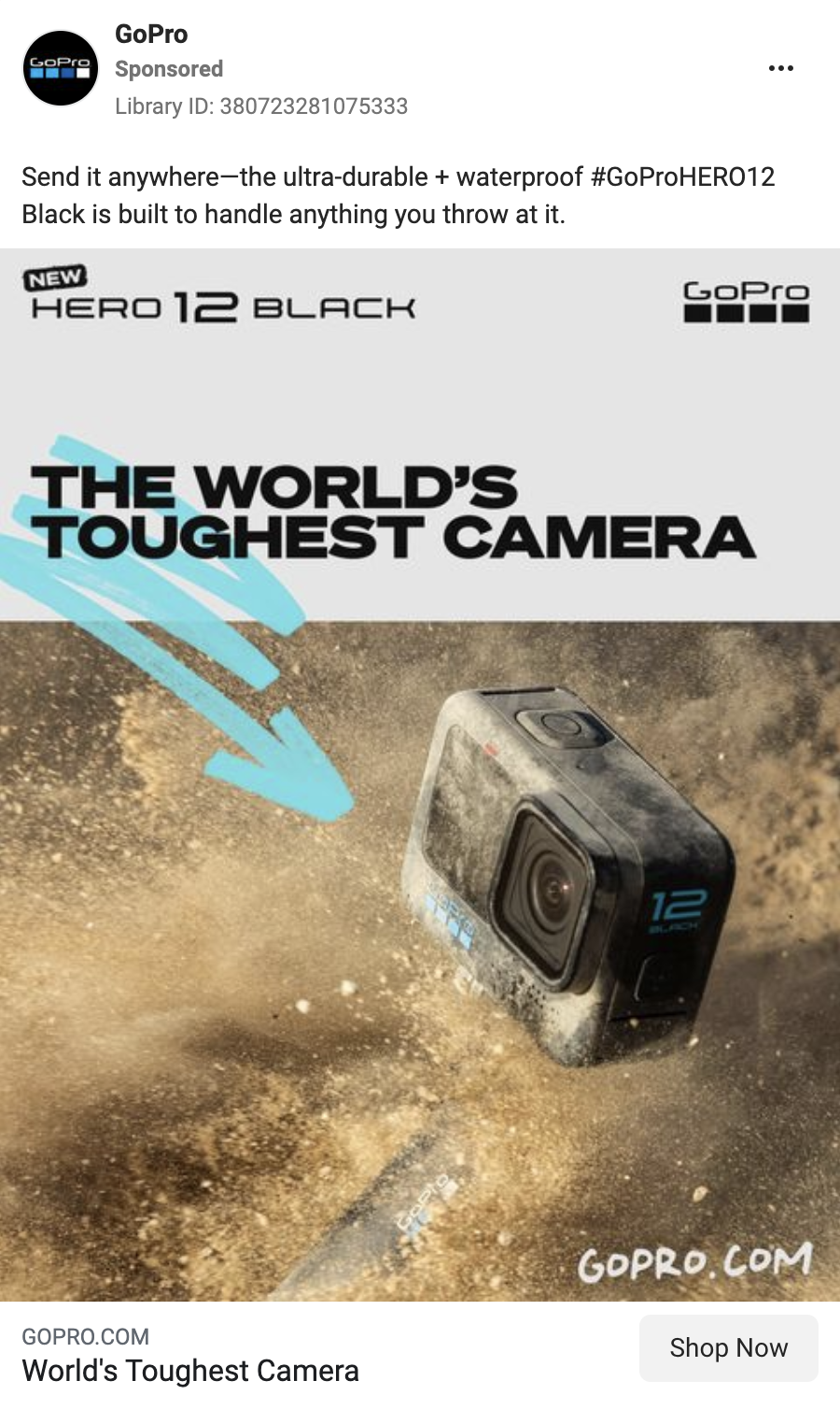
“The World’s Toughest Camera” is not an easy claim to make, but this GoPro ad makes it feel effortless. The whole design works towards the message – the color palette is muted, to associate with rough environments, and complement the illustration of a dusty surface that the camera is being tossed onto with great force, as emphasized by the particles it kicks up. The motion is additionally stressed by the arrow, contrasting with the rest of the design. The fonts for the ad are bold and blocky, magnifying the overall intended feel of sturdiness of the product.
10. Logitech
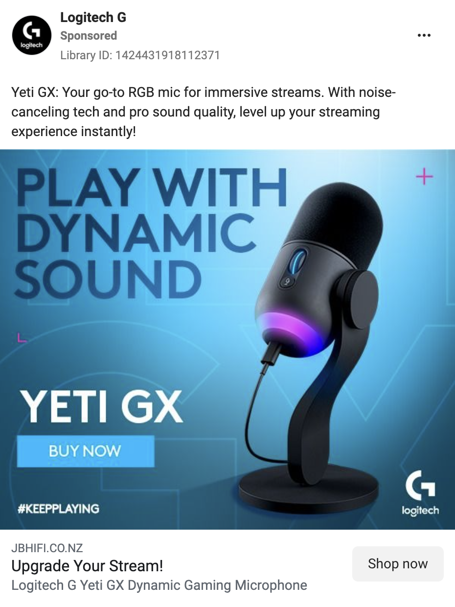
On this Logitech ad, the microphone is the definite star of the show – the bright gradient in the background augmenting its prominence and immediately drawing attention to it. However, the accompanying aspects are also worth noticing. The headline slogan, noting the dynamic sound feature, is right next to it and impossible to ignore, while the brighter product name and CTA button contrast with the darker part of the background. Additionally, the background itself gains some additional texture by including the product name in an outline font – subtle, but it beats a plain two-color gradient.

Get the PPC insights we share with our clients—for free.
✅ Latest PPC news
✅ Our wins & lessons
✅ Creative inspiration
✅ Useful tools & tips
11. Stripe
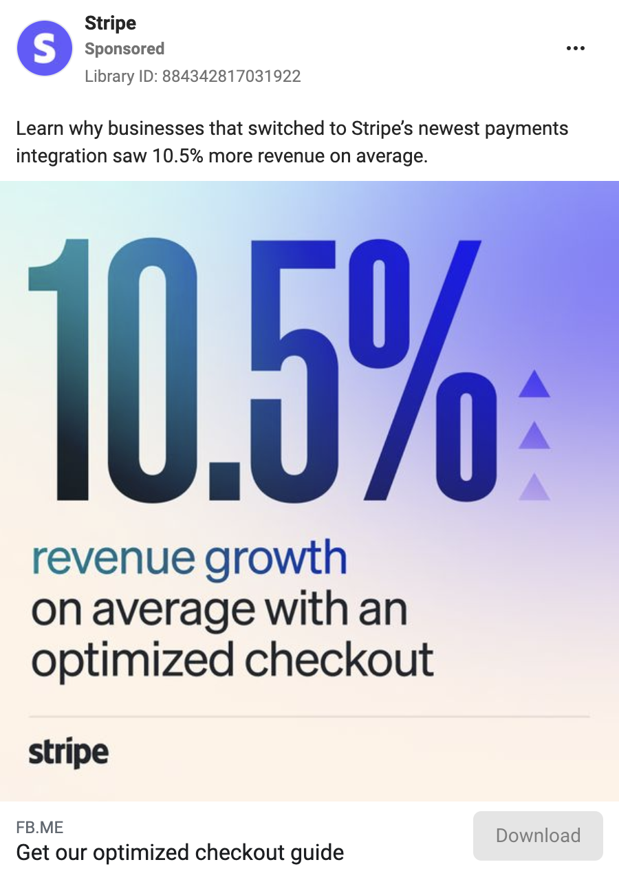
Is 10.5% a lot? It might not always seem so, but when it comes to Stripe’s proposition – the average revenue growth on a checkout – it seems like a big deal. Or rather, this ad definitely makes it look like one. The large percentage, taking up almost half of the image, rendered in the same color as the “revenue growth” part of the remainder of the copy, combined with the upwards arrows next to the percentage command respect and create an implication – this is a huge opportunity you definitely should not miss out on if you’re trying to get the most out of your business.
12. Cariuma
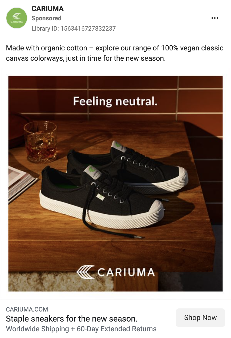
This Cariuma ad is a great illustration of the importance of a good photo. Presenting the sneakers in a contrasting environment, and using stylish, tasteful lighting, the image basically doesn’t need a lot of an overlay – so it doesn’t use anything other than a brand logo and a slogan. The latter can be understood in two ways – the neutrality might refer to the classic, versatile design of the sneaker, or it might gesture at the environmental mission Cariuma seems to back their brand with.
13. Ritual
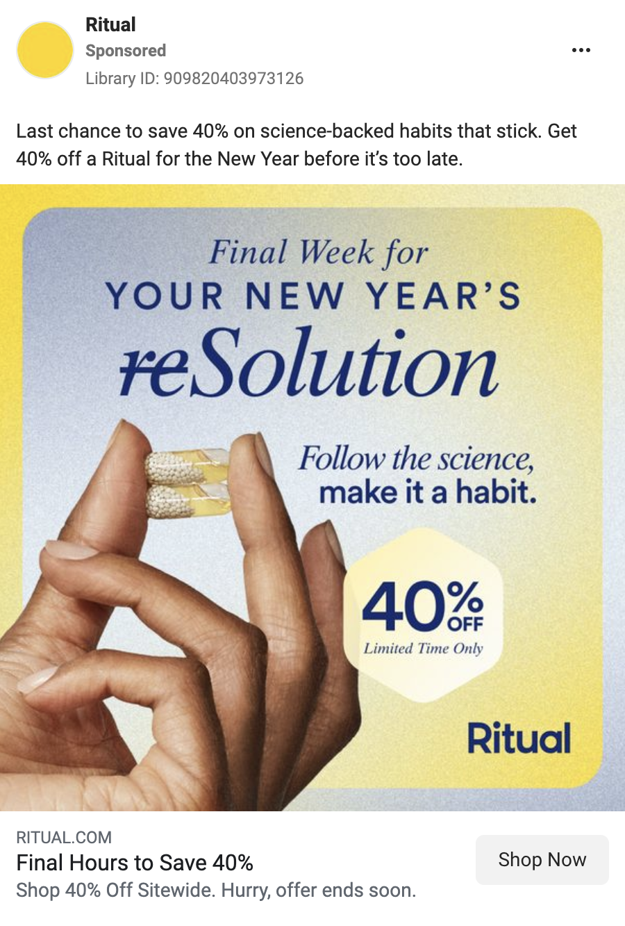
Ritual puts a lot of varied text into this ad, but thanks to its layout, it still maintains interest. The gradient used here clearly imitates the colors of the pill ingredients on the photo, and by applying it in different directions across different design elements, that image avoids looking bland. The slogans rely on wordplay – once referring to New Year’s resolutions, and then by suggesting to make a habit out of following the science (by using their product regularly). The discount badge sticks out thanks to a slight adjustment in the gradient – instead of gray, it uses white in combination with the yellow, giving it a non-metallic metallic golden look.
14. HelloFresh
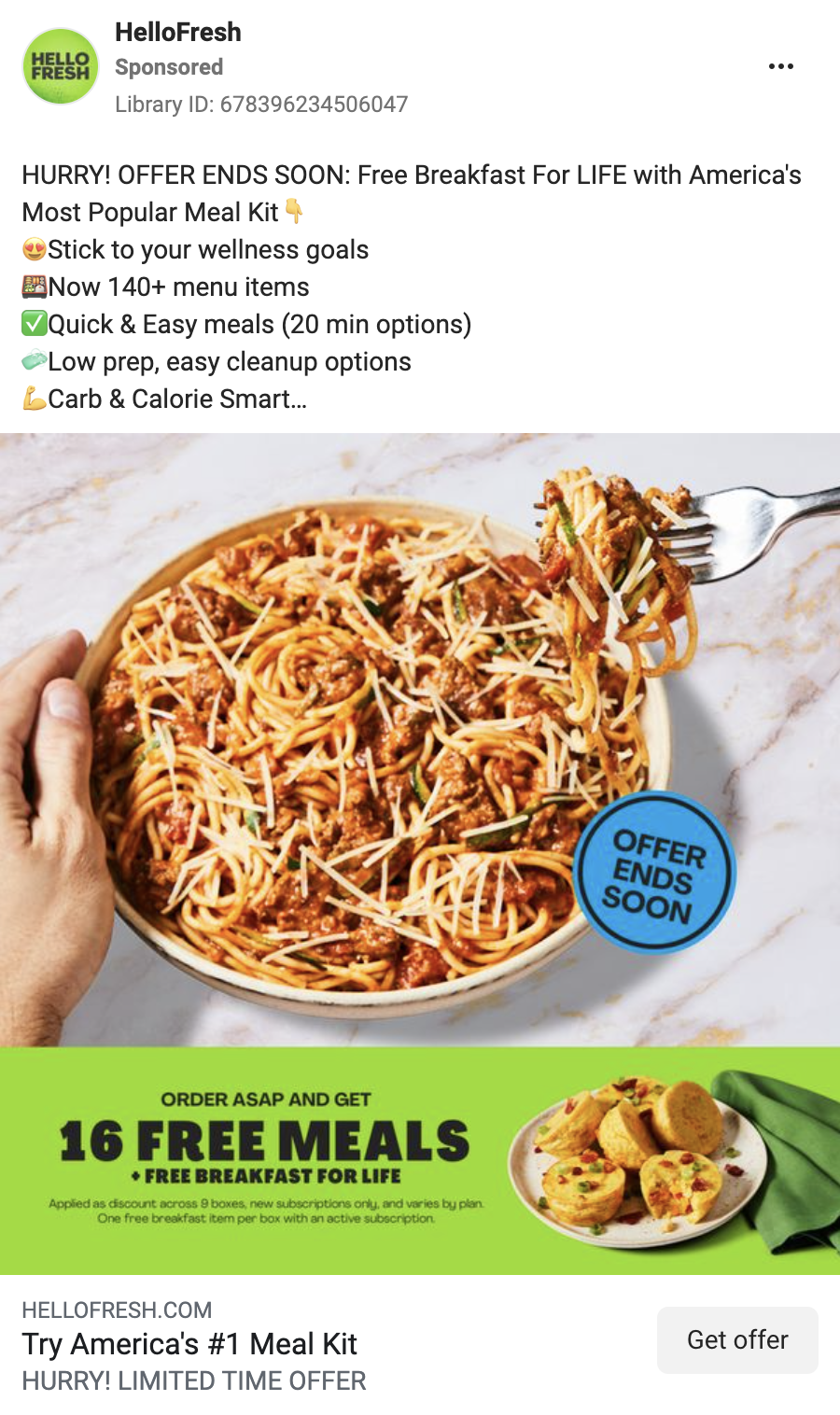
In what is a very clean approach, HelloFresh gives us a full photo of a ready dish, with a bright label that lays their offer out with yet another illustration next to it. On top of that, a contrasting badge with a FOMO incentive is applied to the main photo, which makes that appeal very prominent. From our research, HelloFresh has been on a tear with their ad design – you should definitely check them out!
15. Grammarly
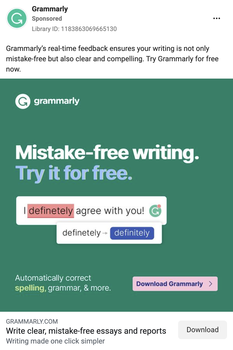
Here’s an ad that aligns neatly with the service it promotes: Grammarly uses a variety of font colors and highlights that are also used by their plugin in order to do what it does – provide the best outcomes for correct writing. As with many other ads on this list, it’s a simple approach that gets the point across swimmingly, and that’s a valuable asset to have.
16. Nuun Hydration
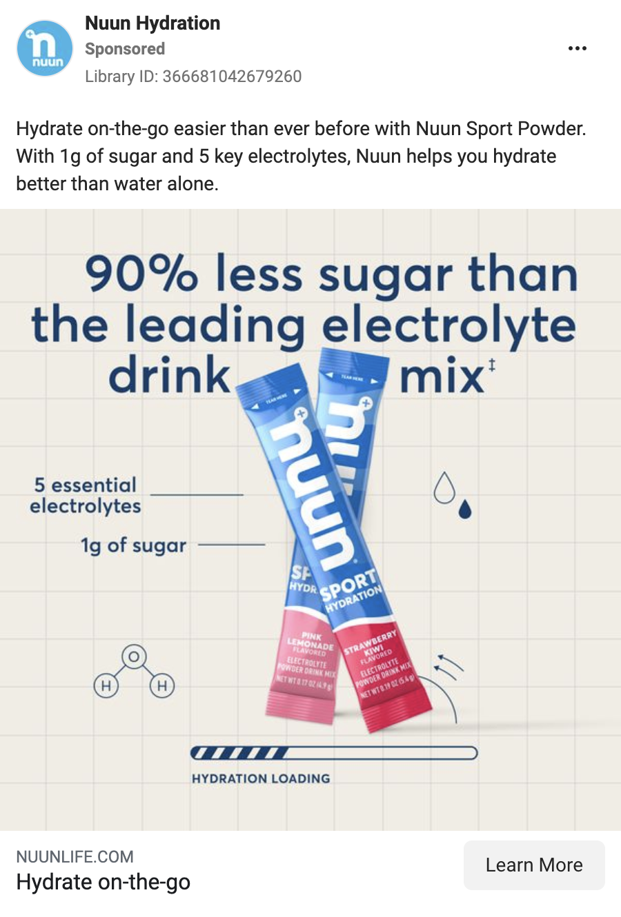
In this one, Nuun goes for a science-adjacent imagery – the checkered background emulating a spreadsheet, the icon on a water particle, and a loading bar for hydration combine with benefits of detailed composition and the large slogan comparing the product very favorably against the competition make for a solid theme. An additional aspect to note here is how the main headline flows around the product image – an integration that makes the layout much more pleasing to look at.
17. Sony
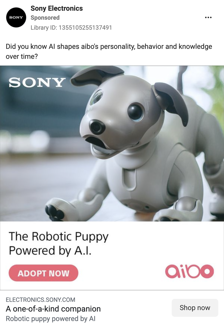
Everyone loves puppies. Does everyone also love robot puppies? Sony sure thinks so. The layout here is straight to the point: here is a cute canine automaton, and a description telling us that it is, in fact, a robot puppy powered by AI, but the curious part is the CTA button. What Sony attempts here is treating this robot puppy – an item, for all intents and purposes – like a real dog, asking the audience not to get it, or buy it, but to adopt it. The text copy augments this reading – both the headline and the primary text specify how the aibo puppy is one-of-a-kind, as its AI programming is capable of developing unique behaviors. What do you think – would you adopt this pup?
18. Prose
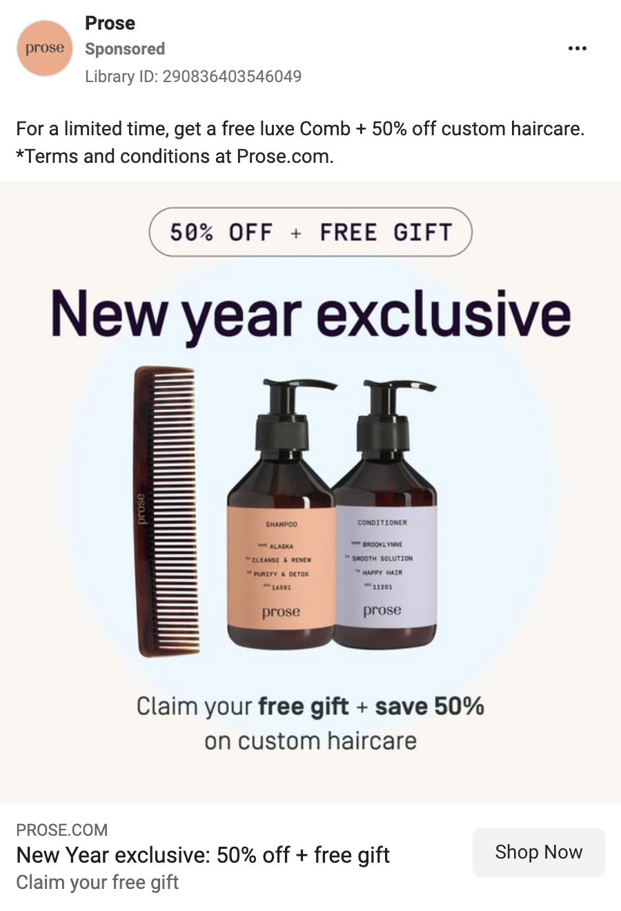
FREE GIFT + 50% OFF – need we say more? This Prose ad is built around the bold parts of its on-text copy – there are multiple shapes and elements as well as the center-focus of actual hair products, but the star of the show here are these two, separate yet combined, incentives. And, well, both of them could be potent for grabbing the attention of the target audience.
19. Monday.com
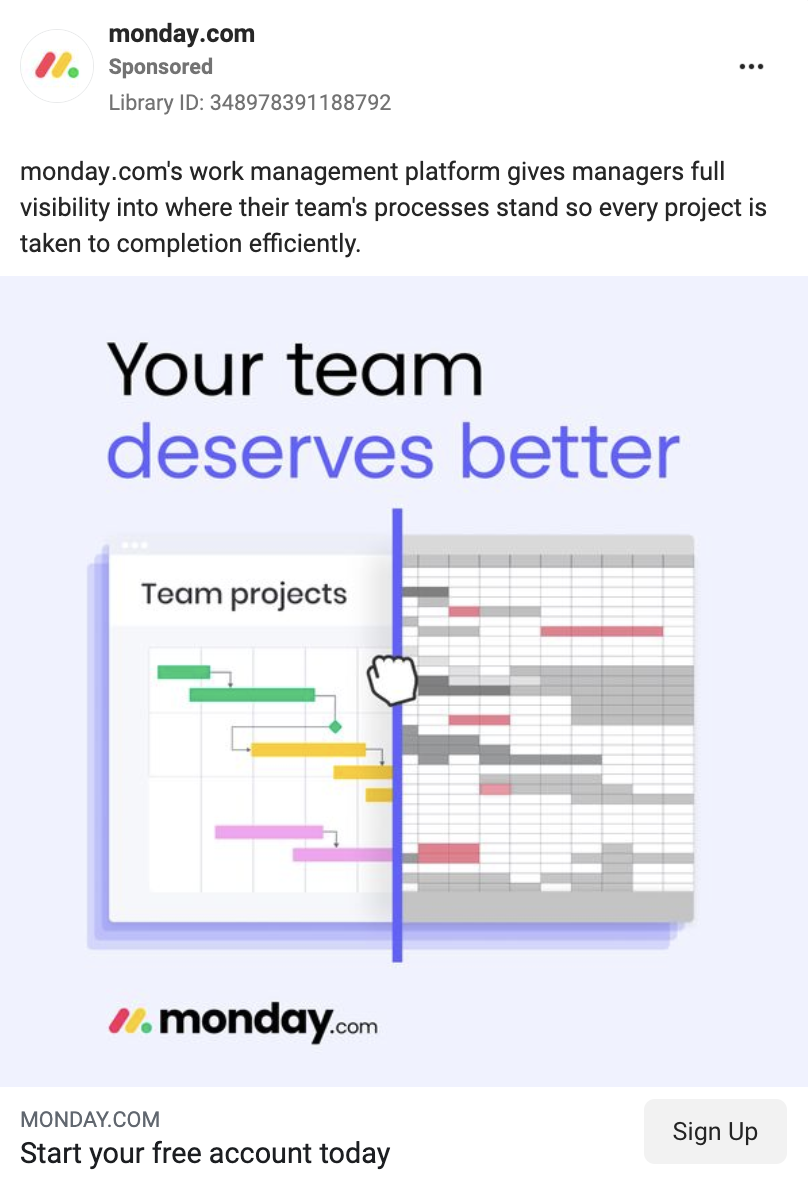
This static ad from monday.com might as well be a storyboard for a video, and we mean it as a compliment. “Your team deserves better” is a solid slogan, and using two colors for it helps draw attention to the “deserving better” part, but the most important part here is the image. A hand icon grabbing a swiping vertical bar taking away those pesky spreadsheets and replacing them with organized, clean monday.com layouts. An easily legible motion, with no motion involved at all.
20. Nike
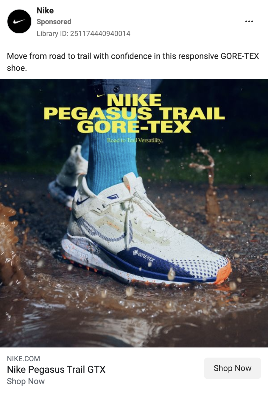
Nike’s photo quality in this example makes the whole ad – here is the shoe, in its intended environment, hitting the mud on the ground without much of an issue thanks to Gore-Tex®. The text only offers a high-contrast product name and a post-script slogan.
? Check out the video on my top-of-the-top 20 ads from this list with notes on why they worked.
Top Video Ads
21. Swatch
In a great example of a seasonal ad, Swatch is here to loudly tell us that the Year of the Dragon is upon us – and with it, their newest watch collection. Most of the ad, however, is built around an animation of a variety of colorful dragons, coiling around the watches aligning with their respective designs. It’s an evocative way of presenting a product collection and making sure it’s a hit with the seasonal audience.
22. OnePlus
Simple, yet to the point – OnePlus advertises their services with a set of iOS-like sliders, which disable the white noise of the world by enabling music. Not much else to say here, as it handily speaks for itself, which is the core strength of this approach.
23. Solgaard
A great remarketing ad. This animated showcase of a Solgaard bag shows us all we need to know. With a simple, low-framerate animation, the bag opens up, rotating through a variety of items that can be stored in it. The “Still curious?” callout puts a foot in the door for the audience, while the 15% off button is bright and prominent, making sure that the special offer won’t get skipped over.
24. Bright Cellars
For starters, Bright Cellars’ thumbnail plainly stating “there are two types of friends” is a great hook on its own – as with other list-based approaches, it piques interest. Then, the video delivers on the punchline to it – the two types of friends are those who bring the wine and those who finish it (and, from reputable sources, we’re being informed that it is, indeed, the case). This funny observation is spliced with people drinking wine and having fun, but then a third way is offered – why not be both? An enticing prospect, but one that ad doesn’t elaborate on, counting on your interest to click through and find out for yourself.
25. Bokksu
Over our research, we learned that Bokksu, a subscription service of Japanese snacks, has some really great ad design in their library, and this is just one example of it. A slight, tasteful animation of the box, alongside a glowingly positive review makes it abundantly clear that if you’re in the market for some exotic treats, Bokksu is there for you.
26. Amazon Kindle
An elegant presentation of Kindle’s art functionalities, this ad isn’t preoccupied with presenting all the features of the process as much as evoking the calm, gentle atmosphere of sitting down with a drawing pad and making art. There are benefits spelled out while the drawing is being created, but they’re largely vague, contributing to the mood. At the end, the soundtrack is supplemented with an additional bird chirp, to augment the finished piece seen on the tablet. More a mood piece than a tech showcase – all in all, a valid way of approaching the subject.
27. Opal Camera
After a brief shot of their webcam in a green void, Opal moves to a presentation of the product in real space – first by keeping it as the focus of shifting environments, indicating versatility, then by showing features like lens cover or USB attachment controls. The color palette is kept largely dark and warm, which helps the white case of the camera stand out. Overall, it gives us all we need to know about the product without having to say a single word – and, after all, showing is what a camera does best.
28. Stripe
Here, Stripe bets on very measured pacing. The ad plays around with which elements show up when, starting with the logo and the headline – but not before the logo itself moves up to accommodate for the smartphone display showing how Stripe’s offering works. The headline also shows one line at a time, with the key line highlighted in a gradient font color, before shifting to the CTA – all while the phone display continues to showcase the process of payment Stripes helps with.
29. On
This On ad commits to the “cushioning” keyword. Their shoe has the “monster cushioning”, so it bounces off of the text stating that benefit, before it leaves the frame, and the text itself transforms into rubber and flies away to reveal the shoe name and On logo following it. A very evocative approach to presenting the core benefit of a product.
30. Mint Mobile
Sometimes you just need to take a well-liked celebrity and let them vamp in front of the camera for some 10-15 seconds to get your points across. Now, not to dismiss Mint’s script-writing ability – if anything, their approach is conveyed so effortlessly by Ryan Reynolds that it feels like it’s improvised, which is a good thing. It provides the audience with immediate familiarity, and we don’t feel like we’re being talked down to. After all, everyone had issues with their phone service provider at one time or another – why not throw in with one that has a famous comedy actor on their side?
31. Booking.com
While this Booking.com ad does include captions and benefits, the star of the show is the musical-esque styling of the proposition of discovery. It specifically hits the tone that many in the audience will be familiar with from pretty much any Disney movie with songs in it, and that’s where its strength lies. Additionally, the fact that the number ends with the off-tune “honestly, I don’t care” adds to the playfulness of it all, making for a fun and memorable ad.
32. Moscot
In yet another case of “less is more”, Moscot gives us glasses in three different colors, and rotates between them, with a faux-selection in circles underneath the images as they show. Clear, distinct, and without any bells and whistles – but that’s what can make an ad seen.
33. Oura
This Oura ad might have as well been a static ad – but, its crucial aspects benefit from being a video. Most of the ad is not animated, with the exception of a part of the headline, meant to rotate the various benefits that Oura can contribute to in the new year, and the ring itself. The latter takes up the focus, placed in the dead center of the ad, and its presentation is greatly augmented by the rotation animation; it might be difficult to fully present an item like a ring in a two-dimensional space, so providing an extra layer through animation improves the legibility of the product.
34. Intuit QuickBooks
With smooth transitions, friendly, round designs, and calm yet dynamic music, Intuit QuickBooks uses a variety of means to assure the audience that they understand the tax season can be difficult, but it doesn’t have to be if the audience trusts Intuit to help. The slogan of “going beyond bookkeeping” is enticing, and amplified by the benefit of unlimited expert assistance.
35. Koala
This Koala ad relies on a question hook followed by a simple video slideshow and slight shifts in the background to deliver multiple 5-star testimonials of their mattresses. It’s not flashy by any means, but it focuses on what’s important: Koala mattresses are well-loved by their users (despite what the next Koala example wants you to think!).
36. Beauty Pie
The thumbnail of this ad is here to announce: the hype is, indeed, real, which is a great hook to start an ad with. What follows is the evidence – excerpts from publications and quotes superimposed on the footage of both promotional shots of the product in extreme detail, as well as people using the product, which makes for a colorful collage that works great as a background for the text. Then, at the very end, the close-up on the product is provided, but with a twist. The data on the label is obscured by the benefits of shopping at Beauty Pie – straight from the warehouse, at a lower price. Since people would be looking at the label anyway, it’s a great place to fit the copy so it sticks.
37. Prose
In this ad Prose plays around with how much information is there in the frame at a time in very interesting ways. For one, there is never more than one word of caption on the screen at any moment, and it’s always centered; while it makes it difficult to follow from time to time, it’s definitely a striking choice. Then, at multiple points in the ad, the video changes approaches – from a single video to multiple videos, to a slideshow of ingredients, to even two videos of very similar footage, but in distinctly different phone-browsing variants. All the while, the ad makes sure that the core benefit – 50% off – is around on a badge, with a text circling it, attracting the audience’s attention.
38. Blue Bottle
Can you say “lo-fi beats to brew matcha to”? Blue Bottle certainly did – their low-key ad showcasing how their tea is made banks on the relaxed, comfortable mood that they want to associate with the process they provide ingredients for. It’s a simple yet elegant showcase that gives us every step of the process while assuring the audience that it’s a genuine best-seller Japanese item. A curious detail here is the CTA button – a request to “secure” a product for yourself is rare, but there might be strength in this strangeness.
39. Lumen
Who says you can’t have it all? This Lumen ad combines a wide variety of video approaches: starting with a quiz, going through real-life, UGC-like footage, to move on to tastefully designed product benefits, only to then go to before-and-after shots, and afterward urge us to take the quiz again and describe how the onboarding for their product works. It’s a lot to fit in a single minute of an ad – and yet, the composition makes perfect sense, without having to use any voiceover to deliver its pitch.
40. Yeti
The static frame of this Yeti ad never leaves the focus, which means that we always know we have a 25% off offer on this particular cup type. However, the video slideshow positioned inside that frame shows the audience multiple angles of the product – both product shots, as well as lifestyle images of the cups being used. The stackable aspect is also included in one of the photos, and the slogan specifying that these cups are hitting the road strengthens their intended use showcase.
Get the PPC insights we share with our clients—for free.
✅ Latest PPC news
✅ Our wins & lessons
✅ Creative inspiration
✅ Useful tools & tips
Top UGC Ads
41. Minted
Minted’s ad uses one of the popular approaches towards UGC video ads – the model is implemented into the frame on a greenscreen, allowing them to take up the first plane without obscuring much of the walkthrough of a service. A good use of hooks helps pre-qualify the audience for this ad and increase CTR.
42. Snackpass
To get an immediate contrast with an approach like Minted, Snackpass is here with a recording on location – while there is backing music, the ad includes the noise of a bustling location to make sure it feels like the person recording the video is really there. Then, a simple walkthrough of how it works, stressing multiple times how convenient and personalized the service is makes for a snappy showcase of what Snackpass is all about.
43. Google
In this video, Google uses a day in the life of the model to illustrate how convenient and versatile Google software is during everyday activities. Granted, these activities happen in the sunny, glamorous locales of Costa Rica, but the functionalities presented – like photo editing or translation – can be used in any environment. While the video includes some editing and cutting around (they do want to show a whole day after all), the ad looks like it doesn’t use anything more than simple phone footage, to which we’re introduced at first by the model recording herself in a selfie format, which helps in lending credence to the user-generated nature of the footage.
44. Peloton
Peloton’s ad starts with a solid hook – hey, stop scrolling, we are about to change your life! The approach itself is very similar to what we already had with Minted, with the model superimposed on a scrolling service page, but Peloton makes extensive use of large, unmissable captions, which vary in size from word to word. While usually such an approach is used for emphasis, it doesn’t look like this applies in all cases in this ad – but that’s also good, as it helps make sure that the audience is paying attention to what is being said and shown.
45. Elevate
Most of this Elevate ad is just a general showcase of their service – an app that helps in diversifying vocabulary. But it earned its spot in the UGC category with the opening hook: Elevate decided to introduce its service with a short sketch of a person suffering through having to listen to someone who doesn’t use Elevate, with a title using a “POV” description, common in video reenactments of finding oneself in a situation, while the camera keeps zooming on the more and more distraught model. This initial setup also works great as a thumbnail, as it looks organic and relatable at first glance.
46. Strava
While the video on this Strava ad is clearly recorded largely from outside of the model’s perspective, the ad still maintains the UGC qualities through the way in which the voiceover is provided – the model is coming through clearly, but it’s apparent that he’s being recorded during or after exercise, with some artifacts in the recording that usually come from the wind interfering with the microphone. This ad also uses its first shot to great effect as a thumbnail, with the model facing the camera and the caption serving as a quote from him.
47. Uber Eats
Another ad with a great thumbnail – it could very well be its own static ad, really. But the quality of the thumbnail is followed by the quality of the video. The approach here is that we’re presented with a voiceover that is illustrated by the model acting out the situations being described, additionally augmented by captions and emojis relevant to the description, as well as sound effects and visual design bits (like the text message interaction) that help with layering the design. The easy-going soundtrack also helps to sell the audience on the whole “there’s nothing to it” vibe.
48. Hismile
Hismile bets it all on a stunning offer delivered from the first-person perspective. “This has to be a joke”, exclaims the person we’re following as they collect all of the free stuff that they get with their toothbrush order. They’re clearly in some sort of a store or a warehouse, with background hum and other people shopping around. Then, the ad briefly transitions into a fully edited product showcase, but even then it doesn’t lose the testimonial focus, showing people being very excited to unpack their own toothbrushes. Finally, the ad caps off with a set of quickly-cut, overblown imagery – warehouses being emptied, people begging for dwindling stock, and excited screams of more happy customers.
For dental-specific examples and strategies, visit Growdent, the specialized dental marketing agency created by the team behind Art Does Ads.
49. Dbrand
You love to see an ad that starts off with this level of confidence. The opening “I’m happy” comes a bit out of left field, as if we’re jumping into it in the middle of a conversation, but that’s the point – we’re already treated as being familiar with the product, before getting a full explanation of how this newest iteration of it improves on the concept. We’re being convinced that the brand listens, the design just works, that it’s everything the model wanted, and the showcase is very dynamic and hands-on, alternating between showing the model and focusing on the case, even though the case is clearly the star of this particular piece.
50. Hexclad
This Hexclad ad shows us that you can have a video showcase and a UGC model without sacrificing one or another. The video is split into three segments – one with the model talking about Hexclad and addressing common concerns, one with the captions of what’s being said, and one with a showcase of Hexclad products in action, being used to prepare food. This layout is balanced so that it’s easy to split attention between these three segments, making sure that the audience has an opportunity to take it all in.
51. Sephora
In this ad, Sephora had the model record their ad in a single-angle, vlog-like setup. There are cuts, but they’re easily skipped over as jumping over the extended, unnecessary parts of the video. What is left is a snappy, comprehensive instruction of using the product, with visual presentation as well as a voiceover description of the steps – all in all, a solid presentation on all fronts.
52. Freshcap Mushrooms
The thumbnail for this Freshcap ad is already great – an arrow pointing from powder and pills towards mushrooms with a simple “Mushrooms.” caption definitely piques interest. The video itself is also great – tightly edited with legible captions, and writing that asks questions but doesn’t provide answers, prompting you to want to know more. But at the very end, this ad has yet another trick to it – it ends on an indefinite note that loops back to the start of the video. This is an ad designed for an auto-looping placement, expecting that the audience will, on accident or not, watch it again, as the platform will automatically get it back to the beginning upon completion.
53. On
In this ad, On’s approach is for the model to treat the camera kind of like a mirror, matching the showcased shoes with whole outfits. To the tone of upbeat music, the model is first showing a shoe type, and then cleverly transitioning into a full fit that incorporates these shoes. Each of those transitions is different, adding to the variety. It’s a clear, wordless showcase that understands how shoes need to be a part of an outfit that you can select for yourself.
54. MeUndies
For the hook of this ad, the all-too-familiar artificial voice, known far and wide as “the TikTok Lady”, appeals to the current year and urges the audience to reconsider their underwear choices, after which the model takes over the voiceover duties. The walkthrough that follows is comprehensive, stresses the important features, and combines real-life footage with MeUndies storefront to ensure that the brand is included in the presentation. The captions are legible, with key words and phrases highlighted, helping the script get processed by the audience.
55. Article
Article shows you don’t need any sound at all to produce a great ad. While this one does include some shots of the model decorating their living space, the ad largely hinges on quick cuts, emphasizing how rearranging your living space with Article is as easy as snapping your fingers.
56. Koala
Similarly to MeUndies, Koala utilizes the synthesized voice for the intro of their ad to follow it up with the model’s voiceover, but their approach to the script is entirely different. Koala attempts to rely on a reverse psychology kind of angle – the claim is that these are the reasons you shouldn’t buy their mattress, but then, instead of providing actual downsides, it frames the positive features, like the overall comfort, convenience, and getting a good night’s sleep, as undesired. It’s a bit cheeky, but as an angle for an ad, it works pretty well, especially when accompanied by the footage of the product so the audience can see how “bad” it is.
57. RYZE Superfoods
Starting with a list is always a good idea, especially if you can deliver on it like this. The model in the RYZE ad comes equipped with a whiteboard to provide us with sketches illustrating the problems she’s describing, adding an extra layer of illustration on top of her already acting out the issues commented on in the voiceover. Then, she moves on to potential solutions (including the shot that the ad uses for a thumbnail, which is also nice – why would we give up caffeine, and what for?) before stopping at the one that’s supposed to actually work – the RYZE product. It’s a comprehensive ad that starts with an educational angle, but then doesn’t leave the audience hanging on just presenting the problems – it also offers solutions.
58. The Farmer’s Dog
In this one, The Farmer’s Dog does a “before and after” showcase of multiple dogs but approaches it by smoothly transitioning from before to the after photo, retaining most of the silhouette of the dog in focus. It’s a clever way of going about it – even when these silhouettes don’t exactly match, it’s definitely eye-catching. After that, we get some more footage of various dogs eating their healthy food and being generally happy. Everyone loves a happy pet, so that’s also a win in our book.
59. Qure Skincare
Qure makes sure that we always see their incentive – the video is framed by the sale and discount notice. But that’s not all there is to it. The video itself is comprehensive, with the testimonial and use case described in detail. The additional interruption by a medical professional is also helpful, as it adds a layer of assurance that what is promoted here is medically sound, but by interrupting the walkthrough of the product use it breaks up the pacing of the ad in a way that keeps things fresh. The list of issues that Qure helps with is also punctuated by sound effects, which keeps it from feeling like it’s just being rattled out to get it out of the way.
60. Shopify
In this one, we start with a captioned introductory hook, to then move on to a tightly-edited combination of glamorous vacation footage and Shopify storefronts, integrating one with another through quick cuts and snappy transitions. It gets the point across very well – the fact that Shopify allows you to enjoy your life while running your business is plain to see even without the sound on, though the voiceover and the music definitely contribute to the overall message.
Top Carousel Ads
61. Meta Quest
A triple-video carousel from Meta Quest is here to enamor us with the wonders of virtual reality. This is a great match – showcasing the artificial environment works much better in motion than as a static presentation, providing a much more evocative proposition. Additionally, gesturing at multiple popular culture mainstays, be it busting ghosts, brick figurines, or things much stranger, helps drive the point home; Meta Quest is here to help you realize your every “I’d really like to be in there!” thought you ever had.
62. Breville
How do you make sure that the breadth of your offer shows through, but isn’t overwhelming? Here is an example. Breville’s videos in this carousel seem long, but the animations are very subtle on two of its three slides, and serve mostly to slowly slide all the thumbnails of the 1000+ recipes the service has available – all while keeping the slogans and endorsements front-and-center. And then, to mix it up, the final slide shows a short chat with an expert, including a smooth animation of message boxes.
63. Ford Motor Company
For this ad, Ford’s idea was to keep it short and sweet. Here’s the car – it’s elegant, electric, and has a lot of space in it. This brevity and minimalism are the guiding star of the approach – from photos with minimalist, slogan-and-logo-only overlay, through using the Facebook headline space for photo captioning, to only a single short sentence of primary text, this ad projects confidence in its contents. Ford is proud of how solid their machine is – did they convince you?
64. Peepers
Sometimes all you need is a straightforward presentation. Front-facing models with distinctly-framed glasses are excellent for the purpose, but then they’re further enhanced with the button doubling down on the proposition – product type, website, additional product photo, and the design’s name, all in a neat little package. A simple enhancement like that can go a long way.
65. Lenovo
Here, the design of the sequence hinges on a central focal point: the only static aspect persisting throughout most of the carousel is the laptop, with backgrounds and software packages shifting around it to communicate the variety of their utility, all applying to one anchor that ties their usage together. Then, the final slide shifts the focus away to the software bundle itself to bring it all home – a full-feature software package offered at a budget deal.
66. Finimize
There are many ways in which a testimonial can be integrated into an ad, and this one makes use of a few of them. For their purposes here, Finimize presents short, slogan-like phrases framed in multiple ways, alternating between social media-like posts from individual people and graphically-enhanced designs with blurbs from respected voices – both Apple and Forbes are solid brands to have in your corner. It also helps that the designs within these testimonial groups are distinct, and the carousel ends up including four entirely distinct takes on a testimonial before going into the final CTA slide.
67. Spot and Tango
There was once a time when Facebook was nothing but people sharing results of personality quizzes – and, still, snappy personality descriptions are something that can grab attention, or even engagement. Here, Spot and Tango uses the concept of a horoscope, applying the short and vague descriptions astrology has been known for to dog behaviors, to then ask its audience about their pets’ personalities. What’s also worth highlighting here is the alternating image layout – blue and white switch places between the frame and the background, which gives the whole sequence a steady pace.
68. Cove USA
Cove USA’s ad here is a great example of combining multiple different kinds of looks at the same product, all while maintaining an additional message on top of it. The carousel combines three assets – a model photo to show the shirt being worn, alongside the environmental benefit of the purchase, rendered in a simple Facebook photo edit-style caption; a short video of the shirt getting unpacked, which is great to indicate the kind of packaging and to give the audience a more genuine feel of the product; and then, a stylish product photo on a distinct background. The primary text of the ad combines a 5-star testimonial with the environmental and ethical benefits of getting your newest shirt at Cove – brief and to the point, which is also great.
69. Cleancult
Cleancult provides us with all the best reasons to care about your cleaning supplies – the primary text combines a good hook, benefits, and an award, the headline text plainly states the product type, and the creative uses short videos with low frame rate, GIF-like animations to provide a minimalist interaction showcase. Add the social proof of thousands of 5-star reviews throughout the creatives, and you get a strong showing of a carousel ad.
70. All Together Now
You wouldn’t usually put an old-timey TV in a bright and sunny garden, and yet, here we are. The combination of natural surroundings with the retro vibe immediately set the stage for the promoted event – before the TV itself shows us the variety of artists participating in it. Then, for good measure, we also get some additional slides with the specific artists imposed into abstract shapes, looking more like statues than transmitters. All capped off with a neat combination of event dates, ticket info, and CTA. The tone for a good time is all set.
71. Ecover UK
A great example of how to make a sequence of images with loads of information that is still legible and doesn’t feel overloaded. Ecover UK hooks in with a provocative underwear photo, but then continues to explain its point, citing statistics, providing actionable suggestions, and finishing on actually presenting the product they’re offering. An element worth noting here is the consistent use of directional arrows – every image in the sequence continues to prompt the audience to keep following the carousel until they reach the product at the end.
72. PetPlate
A good carousel does not need to mean a long one. PetPlate does all it needs to do here in only two slides – one, with a clear comparison of products, where one is much more appealing than the other, and a call to action asking the audience to swipe for details; and the other one, which lays out those details in neatly organized chunks of text. It all speaks for itself.
73. Giant Bicycles
While showcasing specific features of a product could much more often be associated with video ads (and we’ll get there too!), Giant Bicycles’ Defy bike here shows us that a carousel can be leveraged to that effect as well. The first slide presents a full product photo; then, each following image focuses on separate components of the bike, with big, bold headlines noting its benefits. Simplicity is the theme here – both in design, as well as in message.
74. Lumen
In this ad, Lumen uses the first slide to present its audience with a “how to” problem, only to offer the solution – the product – in the follow-up. The order of information is also noteworthy here: Lumen first describes the benefits, then supports them with data, and caps it all off with a review-fueled call to action.
75. Instagram
You would expect the photo-based social media service to have a good grasp on what makes an excellent sequence of images – and you’d be right. In this one, Instagram uses three images and a five-word slogan spread across them to bring its point home – Instagram is the place to catalog your daily experiences and share them with the rest of the world.
76. Accenture
This ad once again uses the carousel’s sequential nature to call out the interactivity, asking the audience to swipe to learn more. In this case, Accenture presents us with a promise of a list – a great organizational principle to keep the potential audience invested. What follows are all problems to be solved in one way or another, but the ad does not offer much in the realm of an answer. Instead, the final slide claims that the beginning of the solution is outside, where there is more to read. The illustration of these slides also helps, providing more of an aesthetic than solid images, and enhancing the messaging.
77. Prada
Prada opens this carousel with a video of smooth product animation – one that showcases the product as a perfume that makes a love letter work. What follows then are two additional static images focusing on the bottle alone, and then the full boxed set of products, ready to help up any Valentine’s Day needs.
78. AG1
In yet another combination of video and static in a carousel, AG1 uses a nice, swiping animation on the first slide to showcase the range of their products, instead of spreading them onto separate slides each, and then provides an additional static slide to add benefits on top of the showcase. This concise approach to the carousel format ensures that everything is relatively plain to see even without much interaction with the ad; but also, the hint of a list on the second sl